···
Sign in
···
···
datavisualization
hashtag
About
Reviews
Updates
1
Followers
0
Experts
Experts
algoswithamber
· 7
manuellevi
· 134
peak.snaps
· 219
ecency.waves
· 200
Posts
Threads
algoswithamber
6 months ago
PeakD
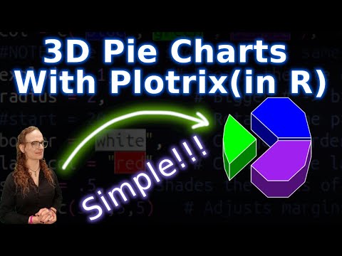
3D Pie Chart in One Line of Code?
As I have demonstrated in the previous tutorials, it is definitely possible to make a pie chart using the ggplot package in the R program...
algoswithamber
6 months ago
PeakD
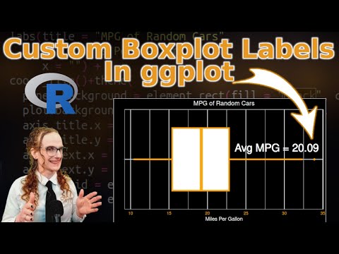
Adding Custom Labels on Box Plots - ggplot Tutorial 9
Suppose you just created a beautiful box plot in the R programming language, but now you want to add the mean, the median, or some other ...
algoswithamber
6 months ago
PeakD
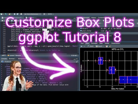
Additional Box Plot Customization Options - ggplot Tutorial 8
In a previous video, we learned how to create a basic box pot, but in today's video we are going to go over a ton of cool customization o...
algoswithamber
6 months ago
PeakD
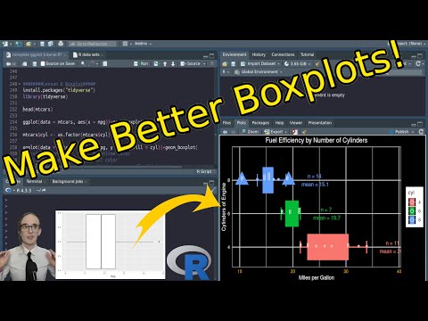
Make Better Boxplots!! - ggplot Tutorial 7
Box plots are a powerful statistical tool that graphically represent five essential characteristics of your data: the minimum value, the ...
algoswithamber
6 months ago
PeakD
Changing Plot Backgrounds in R - ggplot Tutorial 5!
Hey, everyone! Welcome back to the fifth tutorial in our ggplot series. In a previous tutorial, I showed you how to change the scatter pl...
algoswithamber
6 months ago
PeakD
Quickly Change Plot Color Schemes With ggsci : R Tutorial 4
If you're anything like me, then you know it can be difficult to find color combinations that work well together. Thankfully, the R progr...
algoswithamber
6 months ago
PeakD
R-Programming Tutorial : Labels, Titles, and Subtitles with ggplot2
Maybe you've heard the saying that a picture is worth a thousand words, but guess what? Words themselves are pretty important also! Espec...
waivio_purvi-tuvar
9 months ago
Waivio
Looking to enhance your React applications with powerful data visualizations?
Explore the top 7 React chart libraries for 2025, including Recharts, Chart.js, Nivo, and Visx. These libraries offer a range of features...
darwin99
2 years ago
Hive.Blog
Contrasting Airtable and Excel comprehensive
In today's data-driven globe, picking the ideal tool for data management and evaluation is important. Airtable and Excel are two popular ...
tachyons
2 years ago
Sentiment Analysis Report
Sentiment analysis in Python is a text classification technique that determines the emotional tone of a text by analyzing words and phras...
manuellevi
5 years ago
Hive.Blog
[Visualization Monday] Music!
An easy one to read:) This visualization shows the duration of every Number 1 UK Single, from 1951 to 2020. If you like the data but don'...
manuellevi
5 years ago
Hive.Blog
[Visualization Monday] Electric vs petrol
Depending on where you are in the world, you might be actually doing more damage than good driving an electrical car. The following image...
manuellevi
6 years ago
Hive.Blog
[Visualization Monday] Leaked Information at Kodak
[Visualization Monday] Leaked information/Insider trading at Kodak. On Monday, 27th July, information about Kodak was leaked on Tweeter. ...
lewischou
6 years ago
Steemit
How to Implement Data Visualization for Large Screen?
What is data visualization? In the era of big data, visual dashboards have become an important tool for business decisions. A series of...
lewischou
6 years ago
Steemit
Compare Top 14 Data Visualization Tools of 2019
What are the best data visualization tools? Well, that’s a tricky question, because there are so many different types of data visualizati...